After too many years, I had the pleasure of returning to my school in Paris, CREAPOLE/ESDI, as a jury member for the Product Design Master’s program. A great opportunity to reconnect with the team, meet emerging talents, and take the pulse of design education in France.
First, congratulations to the team at Creapole—especially Marie Amandine Gros, who leads the Product Design & Innovation department, Adrian LERALU, Créapole’s Director, and Laurence ROCHET, Head of Professional Integration—for the strength of their pedagogical approach. The students presenting their final six-month projects demonstrated a solid, contemporary design process. Their work integrated thoughtful research, clear brand positioning, experience design, and communication. Most importantly, they are ready to contribute meaningfully to professional design teams from day one.
Second, it was refreshing to see young designers strike the right balance between conceptual ambition and practical, industry-oriented thinking. Too often, student projects lean toward speculative concepts disconnected from real-world constraints. Here, that gap was notably absent.
Design education should absolutely foster bold, out-of-the-box thinking—but not at the expense of the skills that enable young designers to deliver, collaborate, and create impact early in their careers.
A very encouraging perspective on the next generation of designers.
#ProductDesign #DesignEducation #IndustrialDesign #HumanCenteredDesign #Innovation #DesignProcess #UserExperience #DesignThinking #FutureOfDesign #CreativeEducation #EmergingTalent #DesignLeadership #Paris #DesignSchools #NextGenDesigners
Interior Design Show 2026 in Toronto
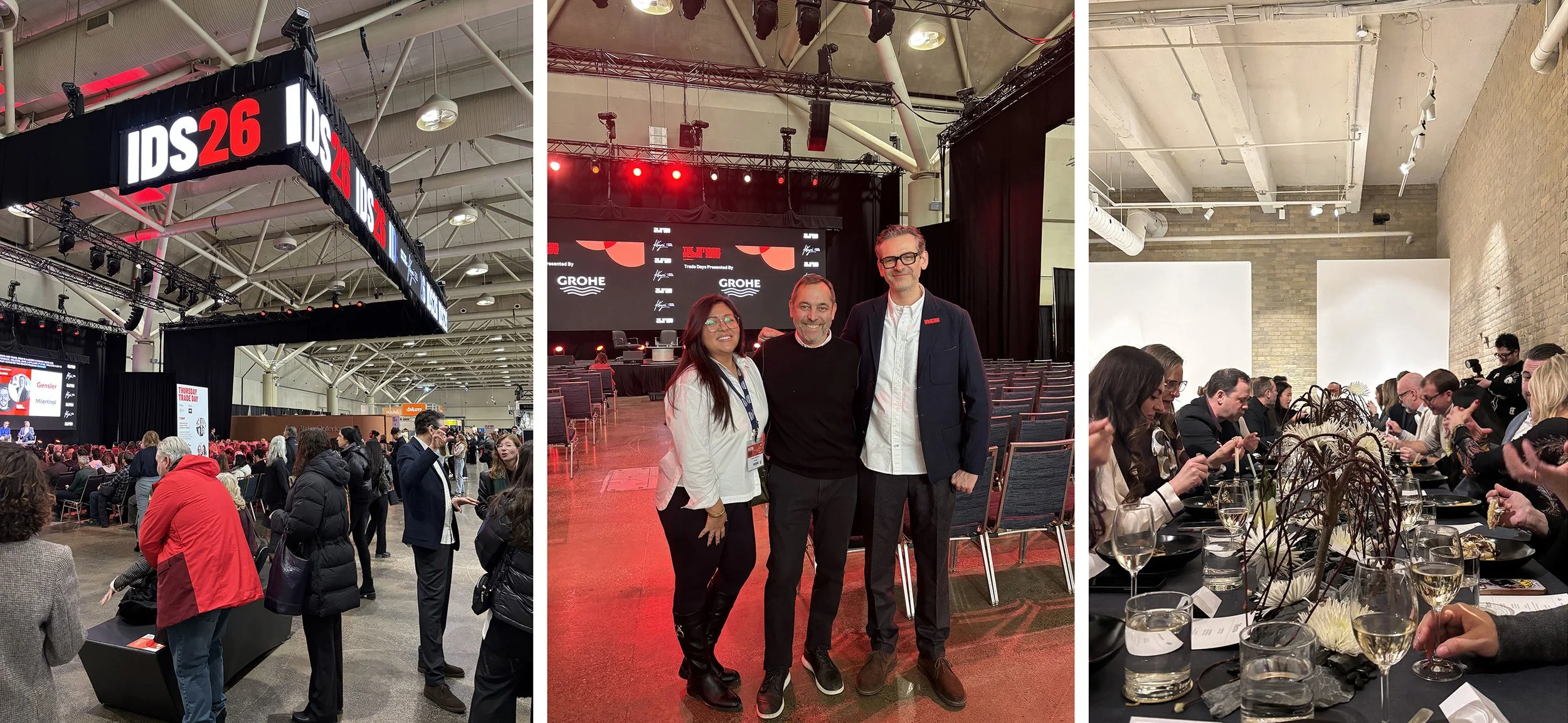
Sub-zero temperatures. Standing-room-only events. Thoughtful conversations about the future of design. That pretty much sums up my week at the Interior Design Show (IDS) Toronto.
We began with a multi-brand evening in collaboration with Arclinea and Fisher & Paykel Appliances at Nathaniel Garcia's Founded by Garcia’s showroom at 340 King Street East. A beautifully curated dinner brought together brand ambassadors and clients, setting the tone for what turned out to be an energizing IDS opening party afterward at the convention centre.
Despite the cold, thousands showed up—not only for IDS, but also for the hundreds of DesignTO events across the city. Proof that a strong design community will always show up when it matters.
What stood out most was the importance of brands like GROHE showing up in spaces like IDS. Trade shows aren’t just about visibility—they’re about connection. Being on the floor, hosting conversations, and engaging directly with the A&D community creates real dialogue, trust, and shared understanding. These moments—face to face, curious, and unscripted—are where meaningful partnerships begin.
GROHE Canada sponsored the two trade days, and on Friday I had the pleasure of delivering a CEU talk on Personalization and Sustainability. The Q&A that followed was smart, engaged, and refreshingly honest—exactly the kind of dialogue our industry needs right now.
The week wrapped with DesignTO’s opening night at the Museum of Contemporary Art, where art and design intersected alongside a striking photographic exhibition by Jeff Wall.
A special shout-out to Will Sorrell and Catia Varricchio, the driving force behind IDS—thank you for continuing to raise the bar year after year!
And huge appreciation to Sophia Benalcazar at GROHE, who flawlessly coordinated the brand’s participation and sponsorship across all these events. Sophia—hats off to you. 👏
Grateful for the conversations, the connections, and the inspiration that make weeks like this so meaningful.
IDSA Winter Gala & 2025 Bronze Apple Awards
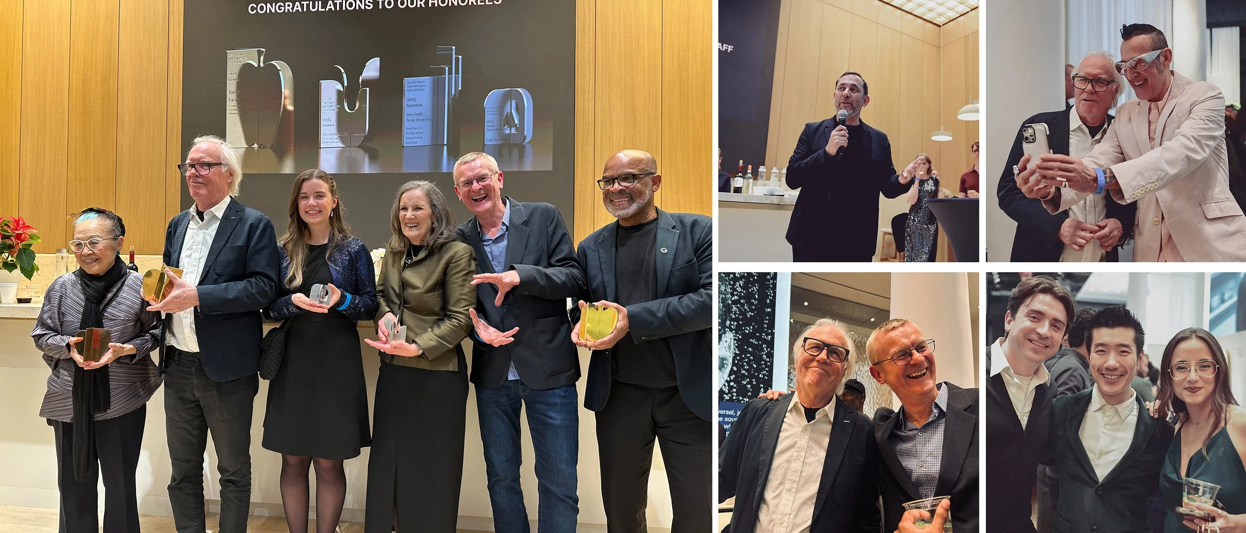
On Thursday we hosted the IDSA Winter Gala at the LIXIL Water Experience Center. The New York chapter of IDSA organized a truly wonderful award ceremony, celebrating Leah-Marie Boake (NJIT - Student Award), Stuart Harvey Lee and the Prime Studio team (Inspiration Award), Nancy Perkins, who started the IDSA Women’s Section with Sharyn Thompson in 1992 (Luminary Award), and, last but not least, our friend Tucker Viemeister, who received the prestigious Bronze Apple Award for his lifetime dedication to great design and a strong, vibrant design community. Congratulations to all this year’s winners!
Beyond the celebrations, this event meant a lot for our team, and it meant a lot for me. I arrived in NYC in the 90s and was welcomed into the industrial design community through regular IDSA events. I got to meet countless wonderful, talented people, got jobs, and learned a lot very quickly. NYC is the birthplace of Industrial Design in America (the first design office was started by Henry Dreyfuss in 1929), and it flourished here before spreading from coast to coast. IDSA was always the go-to place to connect and keep abreast of where our industry was going. At Dreyfuss’s I worked under Jim Ryan, a staunch advocate for the organization, when he was President of IDSA in the mid-90s.
So it was only natural that, shortly after moving our design team to New York City in 2016, we started hosting the IDSA Holiday Gala in our Grohe Live Center on 21st Street, as well as our Perspective series of panel discussions aimed at bringing the history of industrial design to life for new generations of designers. Tucker was our accomplice for the first one, and for the last one I moderated a panel with Michael Cousin, Lucia DeRespinis, and Alberto Montoya, who shared amazing stories about our community (my favorite was Lucia telling us about creating the original Dunkin’ Donuts logo as the lone female designer in Louis Nelson’s office).
Sadly, COVID saw us close our office and move to temporary spaces across the city, until our new LIXIL Water Experience Center was completed 10 months ago. Hosting the 2025 IDSA Holiday Gala meant we have finally come full circle and can again play a role in supporting a community that is more vibrant, diverse, and influential than ever.
A big, big thank you to the IDSA NY Chapter, and to our fantastic showroom team: Amie Milano, Chris Agostinelli, Josh Bryan, and Julia Arieno.
GROHE Water Prize @ WAF 2025 – Miami
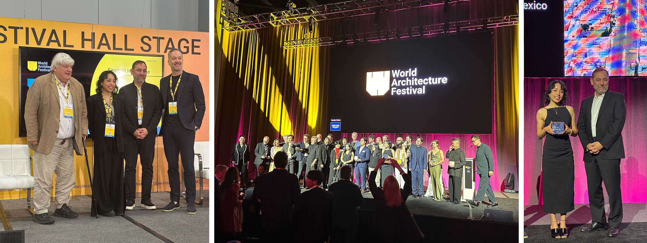
At the heart of the GROHE brand lies a profound respect for water—an understanding that this essential resource is both a universal right and a source of daily joy. It is only natural, then, that we created the GROHE Water Prize to honor research that pushes forward new thinking around water-related challenges at the World Architecture Festival.
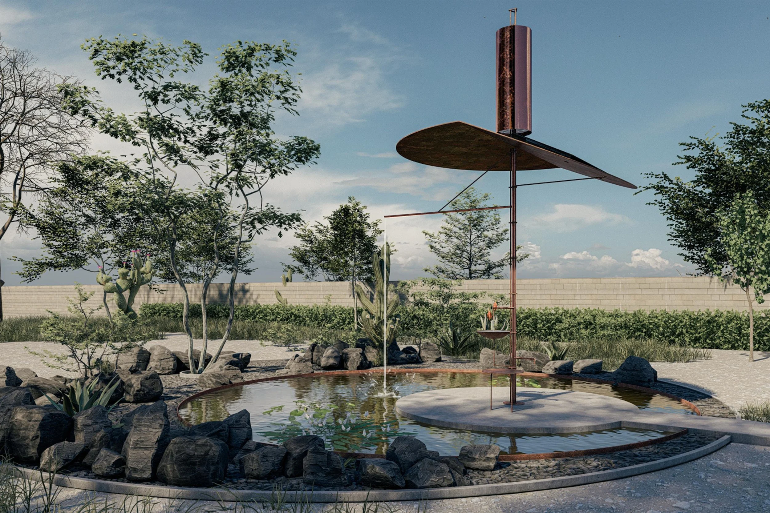
This year, I had the pleasure of joining Paul Finch and Jeremy Melvin from WAF, alongside Patrick Speck of LIXIL Global Design Europe/MEA, to review a record number of submissions: 40 entries from across the globe. After thoughtful debate, the jury awarded the $10,000 prize to “Waterspaces” by Diego Rivero Borrell and Lucia Lozano of Rizoma del Agua, based in Mexico City.
Mexico City—a metropolis built on a lake—faces the paradox of water being either desperately scarce or overwhelmingly abundant. Today, many residents rely almost entirely on bottled water, sometimes spending up to 10% of their income on what should be a public resource. This dependence also generates significant environmental impact, as single-use water bottles contribute heavily to local pollution. Waterspaces seeks to restore equitable access to this vital element while reducing this burden.
Working closely with the community in the Chimalhuacán area of Mexico City, through workshops and consultations, the team developed a natural rainwater-filtration system capable of delivering up to 23,000 liters per year. The jury appreciated not only the technical intelligence of the solution but also its social dimension: the system doubles as a communal space, positioned near a sports facility that already serves as a local gathering point. A solar panel powers the pump, drawing from a 10,000-liter underground cistern that stores the filtered water.
What struck us all was the project’s elegance—its simplicity, its scalability, and its capacity to empower a community by involving them directly in the solution. It is a model that can be replicated across Mexico and far beyond.
The prize funding will help support construction of the first system ahead of the next rainy season in April. Congratulations to Diego and Lucia: we look forward to following them as their vision becomes reality!
#GROHE #WorldArchitectureFestival #WAF2025 #GROHEWaterPrize #LIXIL #Sustainability #WaterStewardship #DesignForGood #MexicoCity #CircularDesign #CommunityImpact #ArchitecturalInnovation
Metropolis Magazine & Biophilic Design
This past Monday, the LIXIL Water Experience Center hosted Metropolis Magazine’s first Biophilia Breakfast Club discussion.
Following opening remarks by Metropolis editor-in-chief Avinash Rajagopal and Dr. Annan Chatterjee from the Penn Center for Neuroaesthetics, our group of architects, designers, and manufacturers engaged in a lively conversation about the impact of nature-inspired aesthetics—such as color, fractal-based patterns, water features, and natural materials—on human well-being.
We explored questions such as: When should actual wood versus wood-like, higher-performance materials be used? How do these choices influence sustainability? And how do our material and design decisions connect people emotionally to their environments?
The dialogue also extended to how we can design spaces that reflect their cultural and geographic context through the use of local materials, as well as the benefits of incorporating living green walls into interior environments.
These discussions offer a meaningful forum for sharing insights and experiences. They also serve as a valuable reminder that the environments we create directly affect our health, happiness, and overall well-being—an increasingly vital consideration in a time when wellness and mental health are top of mind.
We thank Avi and the Metropolis team for this inspiring initiative and look forward to welcoming them back soon!
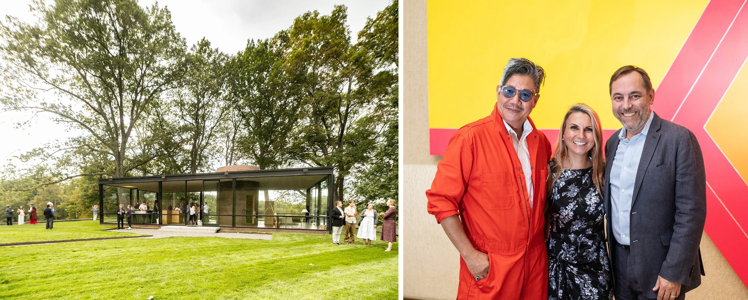
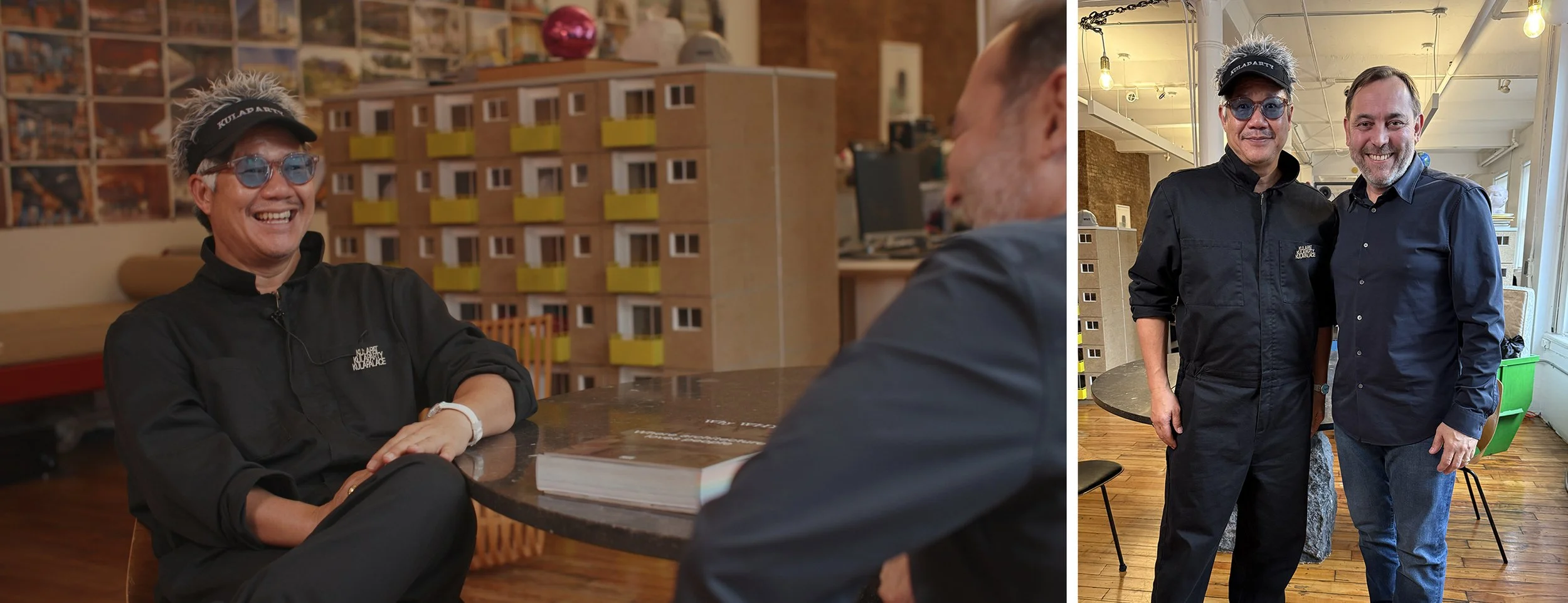
Kulapat Yantrasast Interview & Glass House Event
In September, #GROHE had the privilege of supporting an inspiring evening at #TheGlassHouse, celebrating the visionary work of #KulapatYantrasast — whose latest achievement, the completion of the Michael C. Rockefeller Wing at the Metropolitan Museum Of Art in New York, marks another milestone in his extraordinary career.
Last week, I had the pleasure of sitting down with Kulapat in his New York studio to explore his lifelong engagement with cultural institutions around the world — from the Grand Rapids Art Museum to the upcoming Department Of Byzantine And Eastern Christian Art at Le Louvre in Paris.
Our conversation turned to the notion of #EmpathyInDesign — how architecture can create experiences rather than statements. What struck me most was Kulapat’s genuine generosity and deep curiosity about people. He drew a beautiful analogy between architecture and cooking: a building, like a dish, is a composition of ingredients — each one essential to the depth and richness of the final creation. Perhaps this is why his remarkable body of work does not adhere to a singular formal vocabulary, as his mentor Tadao Ando does, but instead reflects the cultures and communities it serves.
We concluded by discussing the rise of #WellnessDestinations and the essential role that Water plays in his philosophy. For Kulapat, water embodies both our inner nature and our connection to the environment — it calms, heals, and restores. At the Grand Rapids Art Museum, he even designed a reflective pond fed by collected rainwater, uniting function and poetry in one gesture.
I left our exchange deeply inspired and optimistic about the future of architecture — one shaped by empathy, purpose, and respect for nature.
Stay tuned: we will be sharing the video of the full interview later this year on the #DesignInspiration page of the #GROHEUS website.
#Architecture #Design #CulturalInstitutions #Sustainability #Innovation #ArtAndArchitecture #DesignLeadership #Inspiration #DesignThinking #ArchitecturalDesign
Third Grohe Ciné Night: Modernism, Inc.
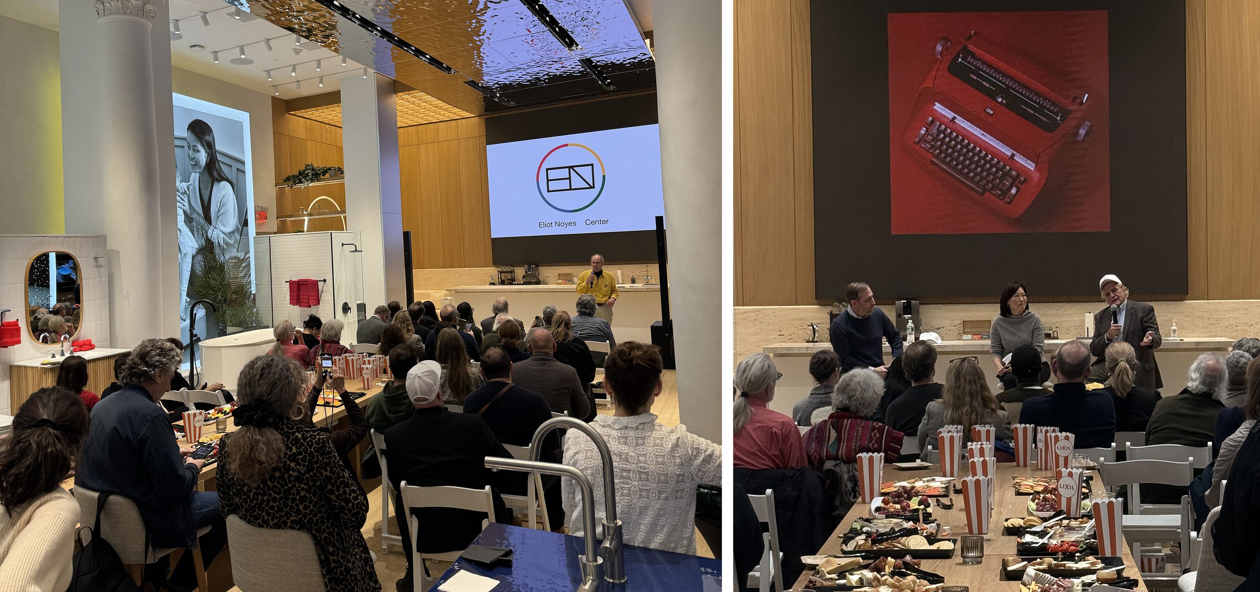
The Grohe Ciné Nights continued last week with a screening of Modernism, Inc. by Jason Cohn. This 80-minute documentary explores the work and legacy of architect and designer Eliot Noyes (1910–1977), from his early involvement at the Museum of Modern Art in New York to his groundbreaking design leadership at IBM.
As a preamble to the film, architect Fred Noyes, son of Eliot Noyes, announced the creation of the Eliot Noyes Center in New Canaan, CT. The Center will promote the principles of integrated design and carry forward Noyes’ enduring legacy.
Following the screening, I had the pleasure of joining Gordon Bruce, design consultant and author of Eliot Noyes: An American Designer, and Teresa Yoo, Vice President of Brand at IBM, for a conversation about Noyes’ cross-disciplinary approach and his ability to bring together the best minds from different fields—including Eames, Calder, and Saarinen—to achieve excellence for his clients. Teresa shared how Noyes’ influence continues to shape IBM’s approach to design, creativity, and problem-solving today.
We concluded by reflecting on the power of creative communities—both those that surrounded Noyes in his time and those we continue to nurture today. It was a reminder of why the LIXIL Water Experience Center exists: to serve as a forum for creative exchange and collaboration.
I highly recommend Modernism, Inc. to anyone in the design or creative fields. And I look forward to our next Grohe Ciné Night, when we’ll be screening Harvard 5 by Devon Chivvis. I’m certain it will spark another great conversation on design and architecture. See you at the LWEC!
Reflecting on an Inspiring Evening at Launch Pad 2025
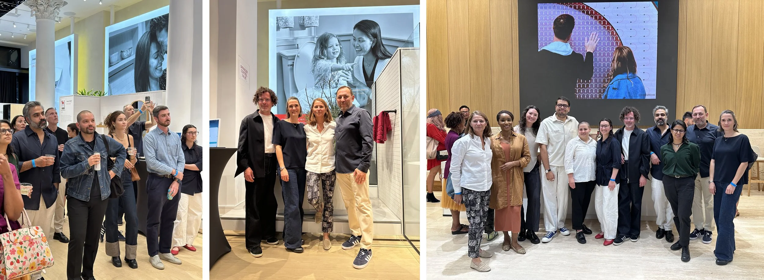
This past Tuesday, I had the pleasure of moderating a panel discussion for Launch Pad, the ICFF/WantedDesign platform for emerging designers, hosted by American Standard at the LIXIL Water Experience Center.
Launch Pad continues to be one of the most exciting events in the design calendar. It was co-presented by LaunchPad's founders Odile Hainaut and Claire Pijoulat of ICFF/WantedDesign, alongside William Hanley, Editor-in-Chief of Dwell magazine, Launch Pad’s media partner.
Our panel featured four incredibly talented past winners who generously shared how the program has impacted their journeys:
• Tom Lerental (Tommy Bloom, 2021)
• Anna Dawson (Anna Dawson Studio, 2022)
• Laura Stoddard Sotomayor & Michael Ortiz Gimenez (Estudio PM, 2025)
What stood out to me most was their honesty and enthusiasm—not just about how Launch Pad provided visibility, but how it created meaningful connections with brands, mentors, and customers.
At American Standard, we’ve proudly supported this initiative as jury and sponsor since 2017. I’m constantly inspired by the creative energy and fresh thinking these young designers bring to the industry. They are not only shaping the future of design—they are the future.
If Tuesday’s panel was any indication, Launch Pad continues to be a powerful platform for talent to emerge and thrive.
Do you know an emerging designer who should be on this stage next year? I’d love to hear about them.
#LaunchPad2025 #EmergingDesign #DesignLeadership #AmericanStandard #ICFF #WantedDesign #NextGenDesign
LIXIL Global Leadership Conference, AXIS Design Center & ARTIZON Museum – Tokyo
Just back last weekend from our annual LIXIL Global Leadership Conference in Tokyo — a week of reconnecting with colleagues, sharing updates from our global businesses, and seeing progress on innovations like PremiAL, Revia, Grohe Blue, and Grohe PureFoam. It was also inspiring to hear how AI is being applied across our organization. Later in the week, LIXIL Global Design held its 19th Design & Brand Leadership Council, providing a platform to discuss initiatives and impact across LIXIL.
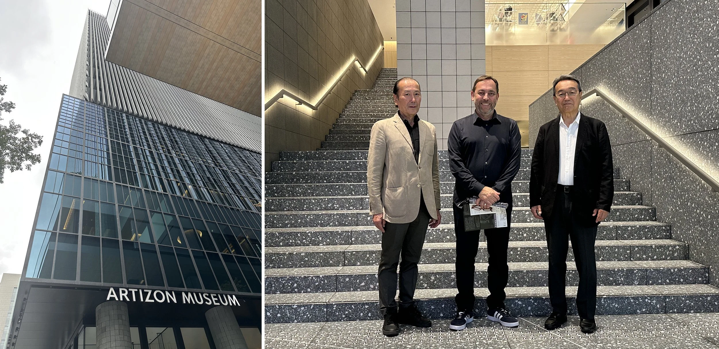
One of the highlights of my trip was meeting Mr. Hiroshi Hishibashi, founder and chairman of the AXIS Design Center & Magazine and President of the Hishibashi Foundation. He graciously guided me through the ARTIZON Museum in Ginza with Mr. Takashi Tabata, Creative Adviser, and Ms. Anna Ueda, Curator of the exhibit Echoes Unveiled: Art by First Nations Women from Australia. What an inspiring space! Mr. Hishibashi’s dedication to both the arts and design has left an indelible mark, inspiring so many along the way.
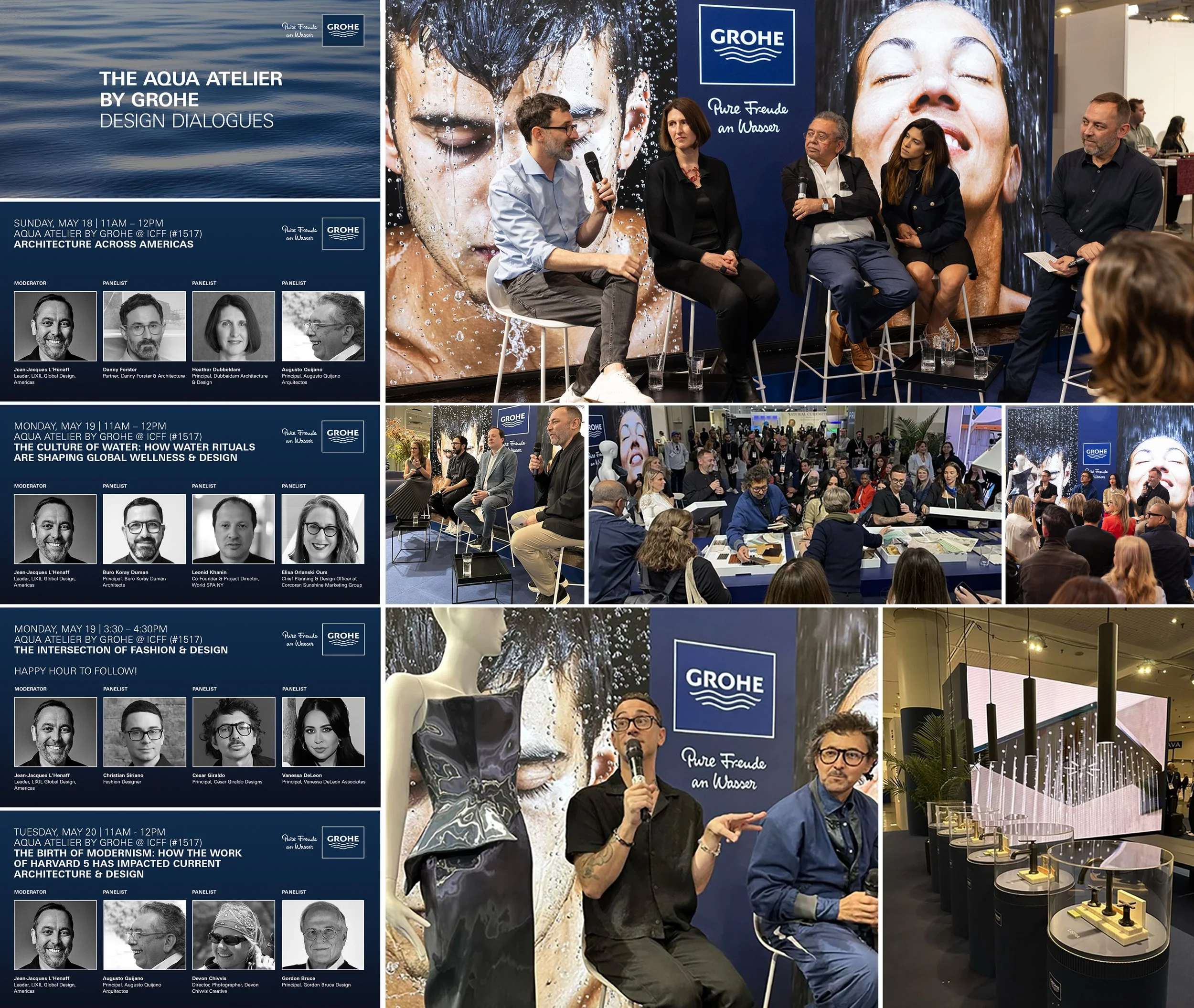
Are you ready to explore The Aqua Atelier by GROHE?
We are excited to present this one of a kind immersive experience at ICFF 2025, North America's leading platform for contemporary furniture design.
LIXIL Global Design Leader Jean-Jacques L'Henaff will lead a series of panel discussions with architects and designers centered on thoughtful design, global trends, sustainable innovation, and the intersection of fashion and luxury.
Experience the transformative power of water and get a sneak peak of our new collection. Learn more: https://brnw.ch/21wSIwD
Panelists:
Danny Foster, Heather Dubbeldam, Augusto Quijano
Buro Koray Diman, Leonid Khanin, Elisa Orlanski Ours
Christian Siriano, Cesar Giraldo, Vanessa DeLeon
Devon Chivvis, Gordon Bruce
Grohe Moments 2024/25
Reflecting on an incredible year connecting with the vibrant New York architecture and design community on behalf of the GROHE brand — thank you for the inspiring conversations and collaborations!
Excited to kick off another exciting chapter this Sunday at ICFF. Looking forward to seeing many familiar faces and making new connections throughout the week!
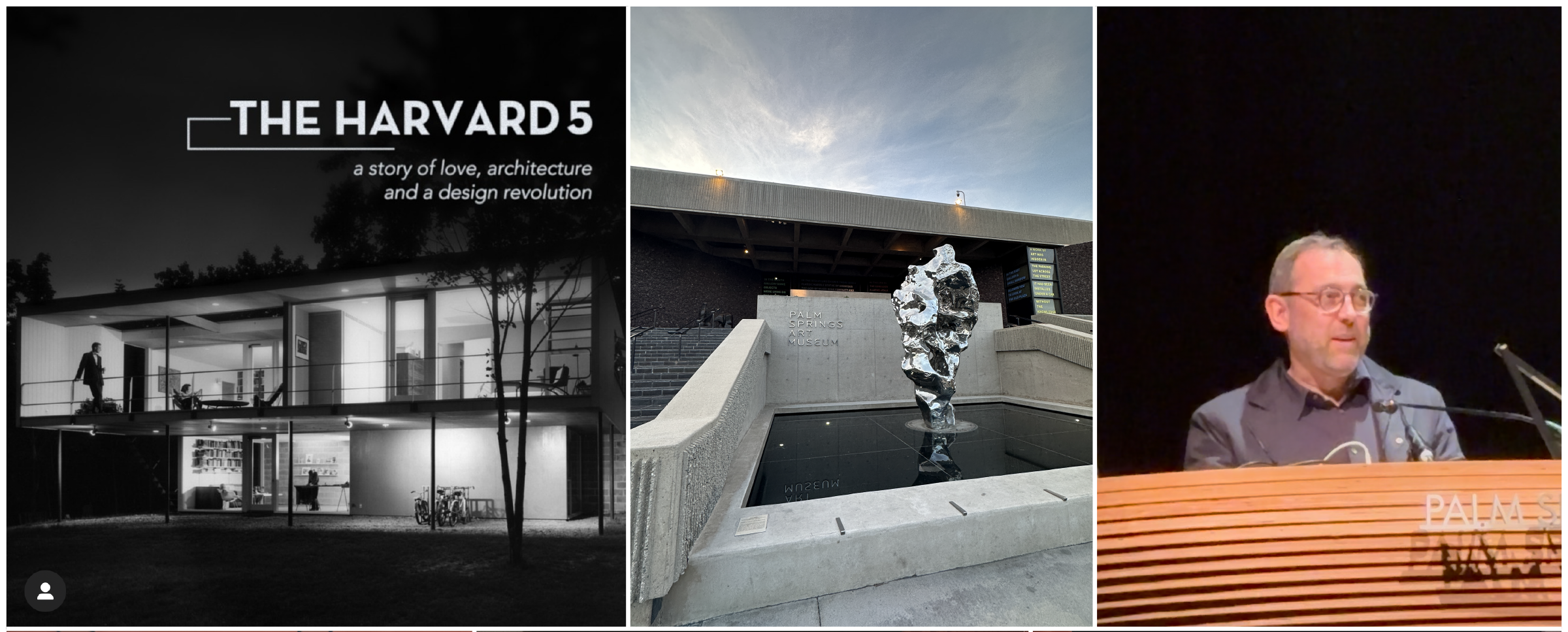
"The Harvard Five" premiere at Modernism Week 2025
This past Saturday, at Modernism Week in Palm Springs CA, I was proud to introduce a documentary, “The Harvard Five”, a very personal labor of love from fellow New Canaanite Devon Chivvis, because it speaks to something that I hope we can reaffirm with not only these visual documents of the past, but the continued camaraderie of the art, architecture and design communities in achieving innovative living in the man-made world.
When I spoke with Devon and executive producer Alicia Albee as recently as a few weeks ago, what struck me the most in the story they were narrating was the importance of the group. In a time of changes – societal and technological – a small group of architects, designers, and artists got together, socialized, exchanged, shared, experimented, and developed a new vision for living. You’ll see them together, on a deck or by the fireplace that looked not quite like your typical New England home. And today 70 plus years later, we celebrate them, their vision, their voices.
For all at Grohe and the LIXIL Global Design team, we are extremely proud to support this wonderful piece of work, and we hope it can be an inspiration for all.
“The Harvard Five” will soon premiere on the East Coast at the New Canaan Library, and will be shown in the Fall at the Architecture & Design Film Festival in NYC, Chicago, Toronto, Vancouver and Los Angeles. We will also host a screening and panel discussion later this year at the LIXIL Water Experience Center in NYC.
LIXIL Global Design, Americas – Visionary Sponsor at the IDSA 2024 Bronze Apple Award
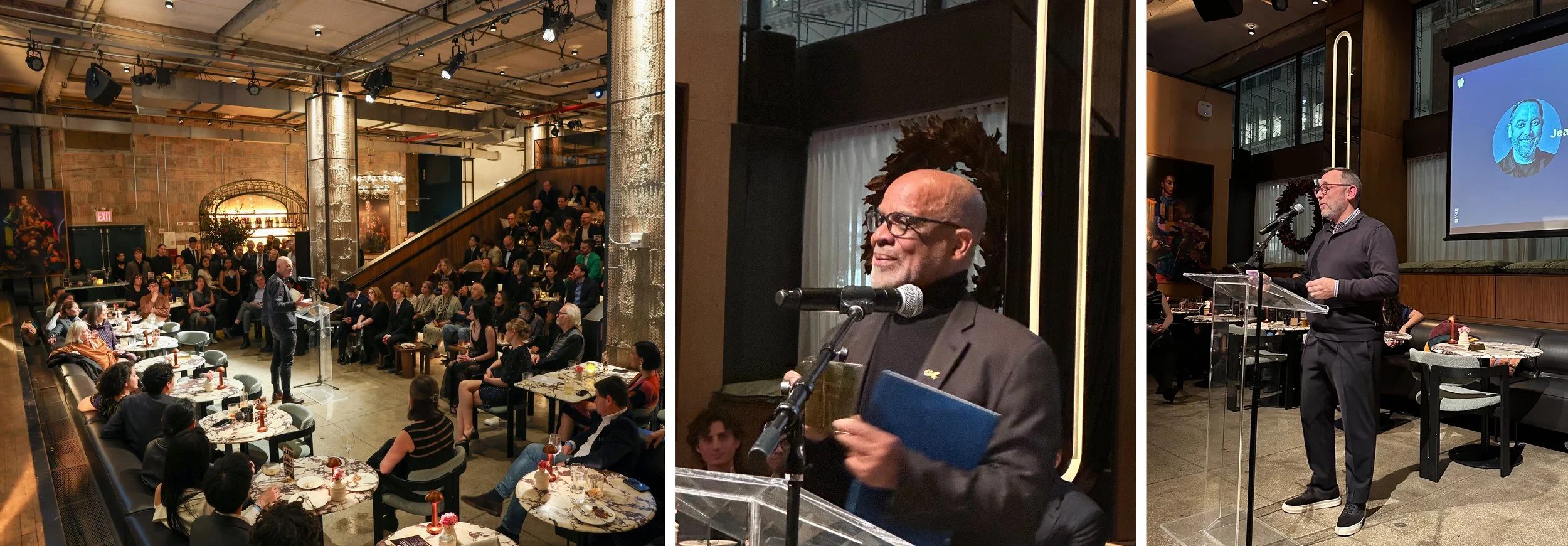
On December 12, we were honored to be the Visionary Sponsor of the IDSA New York Chapter holiday party and 2024 Bronze Apple Award event. The party was very well attended with designers of all levels from students to seasoned leaders in the NYC area. Former Bronze Apple Award winners were in attendance and brought their awards to inspire future designers. I was honored to kick off the night's event and pass the baton to CODY MOORE and ANDREA ZERMENO who presented the inaugural Rising Design Visionaries Competition for NY area students. The winner of this new award - KAIRU TONG from Parson The New School - was given an Ultimaker MakerBot Sketch Sprint 3D Printer.
This year’s Bronze Apple Award went to JAMES HOWARD, a design historian, lecturer, and industrial designer with 20 patents and 300+ products to his credit. James also serves as Executive Director at the Black Inventors Hall of Fame, scheduled to open in NJ in 2027. Through his private career school Entrepreneurial U, he has touched and guided the lives of thousands of design students.
Obra Blanca 2024 - Mexico City
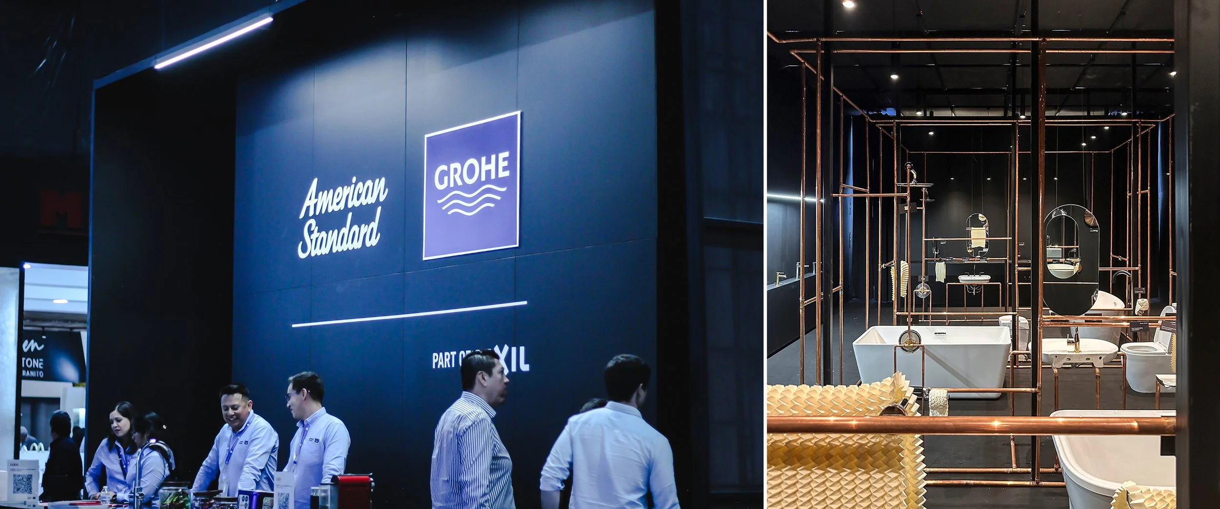
From October 14th to the 16th, Mexico City hosted the Obra Blanca show in the Santa Fee convention center. 160 home, architecture product and finishes brands, from faucets manufacturers to tile suppliers, gathered to show their wares. One stood out by the exclusivity and creativity of its exhibit: LIXIL.
Inspired by the 1972 postmodern novel by Italian writer Italo Calvino “Invisible Cities,” Rosa Agraz and the team at Arroyo Solis Agraz created a space where walls were abstracted to reveal an interconnected plumbing networks moving water around us. A curated selection of sinks, showers, bathtubs and more were carefully positioned, floating, within this network. The overall message reminded us of the importance of this invisible system within our home, and of the value of the water it transports.
It was an honor to join our LATAM team for this event, and to witness the attention they drew from visitors and competitors. My congratulations to Eva Deneken and the team!
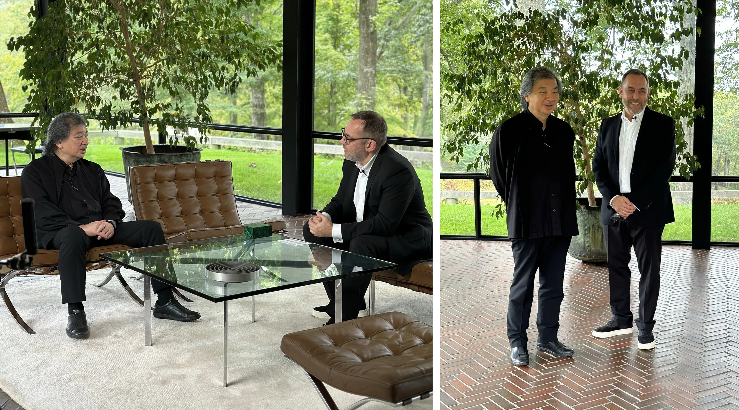
SHIGERU BAN: INTERVIEW @ THE GLASS HOUSE
Few architects take their responsibility toward the built environment as far as SHIGERU BAN does. From his innovative use of sustainable materials to building temporary housing (and places of worship) for victims of natural disasters, his work is impacting directly and indirectly countless lives.
Given his forward-thinking approach, it was only fitting to have PHILIP JOHNSON’s iconic Glass House in New Canaan, CT, as a backdrop to our interview this past Saturday . We spoke about House Vision and LifeCore (a 2016 collaboration with Lixil Japan), how mid-century modern American architecture influenced his work, and about the role water plays in some of his most recent projects. Stay tuned for the video of the full interview on Grohe.us!
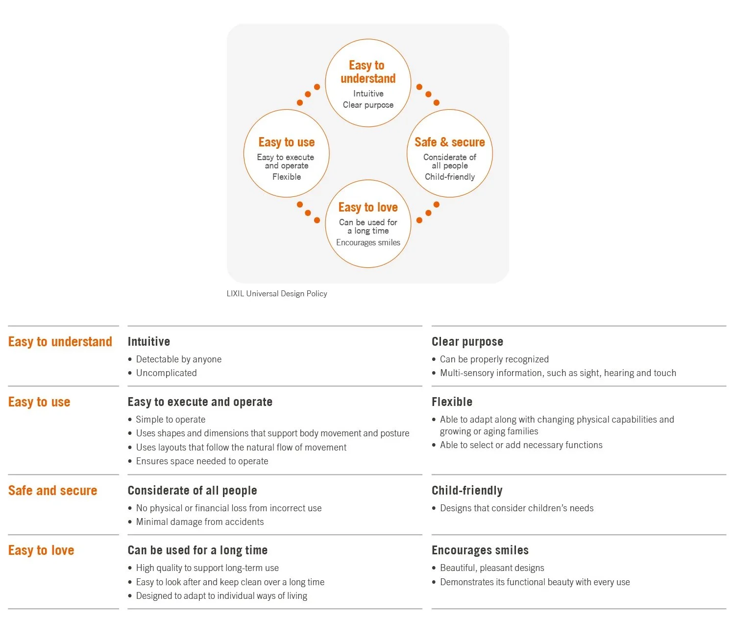
Universal Living in the Americas: What is Universal Design, and Why the Industry Should Champion This Approach
Imagine walking into a home where everyone feels welcome—where doors are wide enough for all to pass through easily, and where every function—light, water, air—is easily controlled by any user, regardless of age or ability. This is the essence of Universal Design (UD), a forward-thinking approach to crafting products and environments that are inclusive and accessible to all, irrespective of age, size, cultural background or disability.
And the importance of inclusive living is growing rapidly. From 1971 to 2021, research from the Pew Research Centerrevealed that households spanning three to four generations have quadrupled, encompassing nearly 60 million people – or 18% of the U.S. population.
By embracing UD, we open up a world of possibilities, transforming spaces into havens of comfort and functionality for every individual. At LIXIL, we bring UD to life through our consumer insights, ensuring our products are designed to address the varied and evolving needs of consumers, ultimately enhancing their quality of life.
The Essence of Universal Home Design
From user-friendly features to conveniently placed amenities, universal home design considers the needs and desires of all individuals. Our approach transcends conventional boundaries, diving deep into user needs and aspirations across demographics.
But how do we uncover those specific needs? Through meticulous pre-search―which helps us anticipate future needs and trends that enable us to design innovative solutions that stay ahead of the curve. Using focus groups, consumer-focused research and regional market insights, our Global Design team integrates insights from the very beginning.
For that very purpose, we located our design studios strategically around the world—in Dusseldorf, New York, Singapore, Shanghai, Tokyo—in order to capture these insights within different cultural environments. This not only helps ensure products meet diverse consumer needs, but actively works to make their lives better through specific interventions. For instance, sometimes issues that we uncover are a much larger obstacle for individual users than we initially realized—so we have to pivot. Our research gives us the foundation to understand and address the full range of consumer needs all over the world.
Why the industry must embrace Universal Design
According to a 2023 report from the Joint Center for Housing Studies at Harvard University, just 3.5% of homes include crucial universal design elements. This gap signifies an opportunity for designers and architects to distinguish themselves in the market by creating inclusive environments and products.
If we are dedicated to building the best living spaces, then we must prioritize the needs of different demographics from the very start of the design process. We inspire designers and architects to embrace universal design by incorporating inclusive design thinking, collaborating with accessibility experts, staying informed on standards, leveraging technology, and advocating for the importance of accessibility in their practice. This commitment is deeply embedded in our DNA, guiding our daily work, and our dedication is evident in the quality of our products, instilling trust and confidence in our consumers.
And when creativity takes flight, the results are truly inspiring. For example, the American Standard Zero Threshold Shower Tray is designed without any ledge or sill, sitting flush with the bathroom floor. This makes entering the shower easier for those using a wheelchair or walker, as well as individuals with mobility limitations. Additionally, the GROHE Smart Connect Shower features a convenient push-button remote control that can be mounted at eye level, eliminating the need to reach up to the showerhead to adjust the spray settings. And, as always, the more we collaborate with each other, the better equipped we are to address our customers’ recurring issues.
As an industrial designer affecting billions of people around the world, I have an obligation to discover and address a variety of issues. Universal Design is the answer – helping create living spaces that are comfortable and delightful for all—not just a few—meeting the diverse needs of today's population, and proactively addressing the needs of the future.
And as industry leaders, it’s our responsibility to champion this approach, creating homes that are inclusive and enrich the lives of every individual. At LIXIL, we make better homes for everyone, everywhere. This is the essence of what design should strive for—with unrestricted creativity and deep insights, we gain the freedom to innovate, experiment and learn.
Written by Jean-Jacques L’Henaff, Leader, LIXIL Global Design, Americas
In this role, L'Hénaff identifies deep connections between product, brand, users and stakeholders to create lasting value. L'Hénaff joined LIXIL in 2013. During his tenure, he built an award-winning team, responsible for designing all American Standard and DXV products, branded environments (corporate headquarter, showroom, trades show exhibit), and, more recently, the new American Standard brand identity.
LIXIL @ Interior Design Show (IDS) Toronto
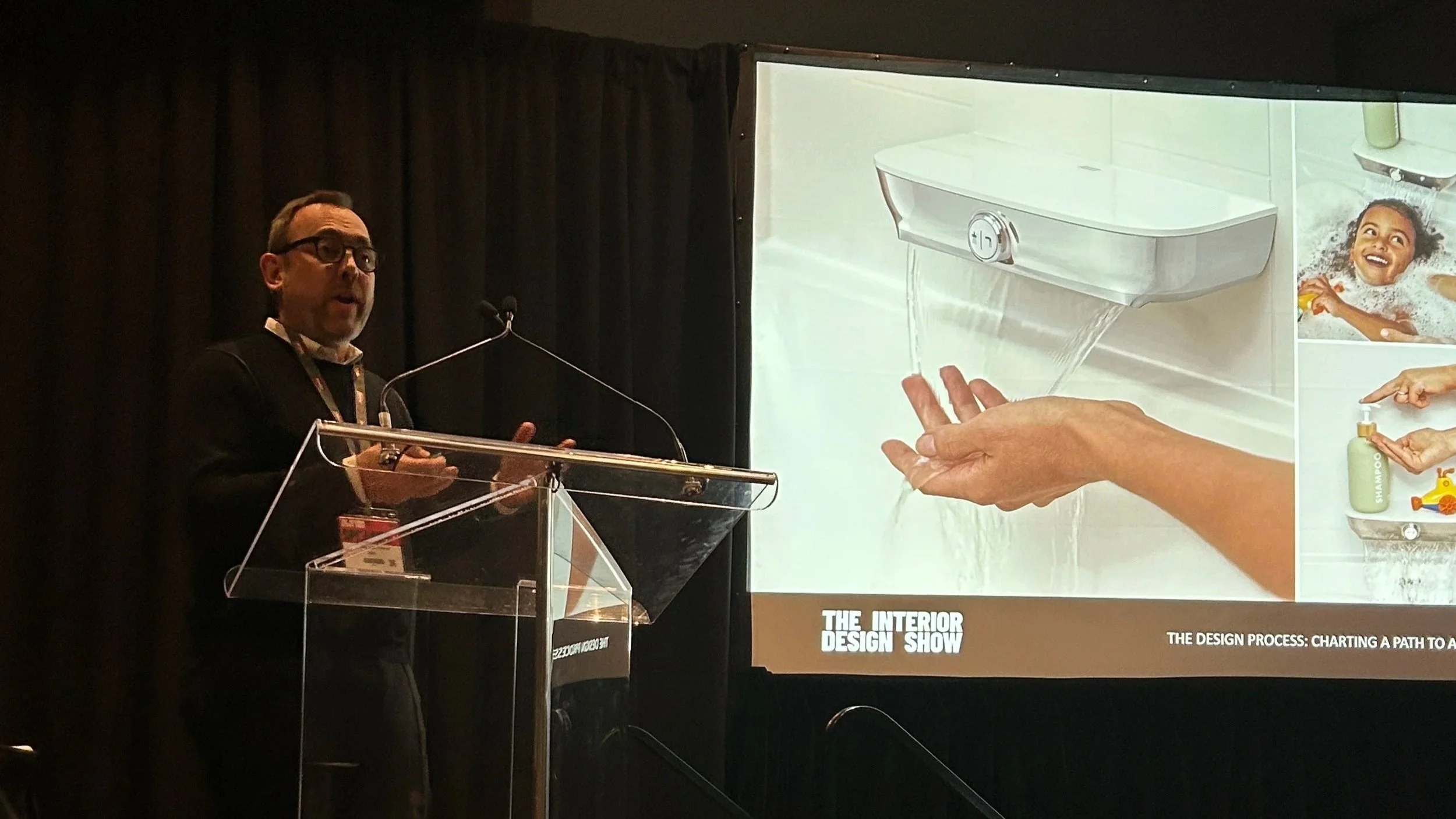
It was an honor to represent LIXIL at the recent @International Design Show in Canada, where I had the opportunity to speak with a passionate and diverse group of designers about the intricacies of our design process and the impact our industry has on the environment.
In my session, we explored how LIXIL places the user at the core of our work, leveraging trends and our distinct brand lenses to guide the development of innovative and sustainable products. The lively Q&A session that followed was particularly inspiring, as we explored the significant impact of our design choices on the world around us and discussed the importance of pushing the boundaries of what's possible with aesthetically pleasing, eco-conscious design.
A huge thank you to the IDS team for organizing a wonderful platform for discussion. I'm looking forward to the next show and the opportunity to connect with more inspiring minds in the design community.
#DesignInnovation #Sustainability #LIXIL #EcoConsciousDesign
Design and Brand Identity Transformation at LIXIL
Linkedin, July 18, 2022
A defined curve. A strong taper. A vivid splash of red. These design elements are just the most visible signs of a deep transformation at American Standard, a world-renowned bathroom and kitchen brand whose name dates back almost a century and a half.
These features are part of a new range of design references called Signature Elements. Harnessing the power of design, they create distinctive products to meet evolving consumer needs. This reference line defines the look of American Standard products and makes them instantly recognizable. It’s integral to a strategy that has strengthened and unified a brand whose products, and even logos, once varied by region.
The changes at American Standard are another big step forward in LIXIL’s revamp of its major brands. This move began with GROHE in Europe and continued with INAX in Asia. The entire business was reimagined to put consumer-focused design at its heart and sharpen the regional and cultural character of each brand.
“The collection of brands allows LIXIL to operate in different markets in a truly authentic way, which a purely global brand simply can’t do,” says Paul Flowers, Leader of LIXIL Global Design and Brand Identity. “The transformation of American Standard is part of our strategy to realign our portfolio and allow the brands to play different roles in each market.”
Building the Brands
Flowers first made signature elements a foundation for visual brand identity while leading the design team at GROHE. Touches such as these had long been used in the automotive and electronics industries but were revolutionary for a maker of kitchen and bath fittings.
The approach worked. Flowers joined GROHE in 2005, and the innovative products his team designed soon helped push annual sales to new heights. In 2011, GROHE won the prestigious Red Dot industry award for design team of the year, recognized for the Signature Elements that were an essential part of non-verbal brand communication and helped create a distinct design identity.
Flowers joined LIXIL when it acquired GROHE in 2014 and applied his experience to refresh its other brands. Product development was refocused on what consumers want and on devising solutions relevant to the way they live.
“It’s really nice when you’re showing the world something new that is based on an approach that has already proven to be successful,” Flowers says of the changes at American Standard. “It reduces the risks of innovation and allows you to demonstrate its value for consumers and the business.”
Leading with Design
LIXIL’s design-led approach begins with what it calls “presearch”: studying consumer trends and behavior to ensure its products are meaningful and add value to people’s lives. This process goes back to the beginning. Instead of presenting people with a range of options to pick from, like much standard research, the designers at LIXIL observe people to understand their unmet needs. These insights are then fed into every aspect of design and product development.
The process also involves defining the values for each brand and translating them into the reference objects, so they are reflected in every product. The American Standard Brand is defined as inviting, dependable and pioneering. These values took shape as the signature elements – pillow, taper and frame.
“Our signature elements incorporate semantic elements that communicate directly with consumers,” Flowers says. “Our responses to the world are coded: rounded shapes are inviting; a strong base looks dependable. There’s a lot of psychology behind this that we can draw on. This allows consumers to identify our products at first glance.”
As well as forming the visual essence of the brand, these elements have practical applications. The curved pillow shape, for example, makes fittings easier to clean. A tapered bathtub that is wider at the top than the bottom helps save water. The red color, when used on a button, signals that a product is on.
At LIXIL, Design Starts with Presearch
When LIXIL’s designers are developing new products, their work starts outside the studio. They attend design events and tradeshows to understand current and upcoming trends, and the social drivers behind them. A lot of their time also is spent talking with consumers about kitchen and bath products and observing how they interact with them.
This process of gathering ethnographic and market insights is what LIXIL calls “presearch”, and it’s the foundation of the company’s consumer-focused strategy across its water brands – American Standard, GROHE and INAX. It allows designers to understand not just the preferences and pain points that people can explain, but also the responses they can’t put into words.
“The purpose of ethnographic research is to listen to our users and observe the coping mechanisms and unmet needs they may not even be aware of,” says Jean-Jacques L’Hénaff, Leader, LIXIL Global Design, Americas. “It allows us to understand what consumers want even when they can’t articulate it. And that helps us design the products that will appeal to them tomorrow.”
For L’Hénaff’s New York-based team – the design force behind the American Standard brand – COVID-19 restrictions made this vital process more difficult. Unable to carry out research in people’s kitchens last year, the team installed cameras that allowed them to observe remotely how people prepare meals. They came away with a better appreciation of the gap between what people say is important to them and what they can achieve with the technology at their disposal. These insights are now shaping the development of new water technology products.
When it comes to anticipating trends in design and technology, New York is the ideal place to be, L’Hénaff says. The city is America’s branding and communications capital as well as an architectural hot spot. Tapping into its dynamic energy and creativity helps the LIXIL team stay ahead, creating authentic American products that consumers across the country will embrace for years to come.
“The user-centric approach at American Standard is the key to our longevity,” L’Hénaff says. “It will always resonate – today and 10 years from now, just like it did a century ago.”
Bridging the Gaps
With multiple industry-leading water brands in global markets, LIXIL recognizes the importance of ensuring that each is culturally rooted in its home market and meets the needs of consumers in that region. For this reason, the presearch phase includes ethnographic research that contributes to a strong regional identity and makes each brand distinct from the others.
But being part of the wider LIXIL organization means synergies and efficiencies can be created between the distinct regional brands, too. This allows them to leverage technological platforms that are customized through brand and design lenses to make them relevant in each market. A good example is GROHE’s award-winning SmartControl line of shower systems and faucets – thoroughly European designs incorporating technology from INAX in Japan.
The goal of cultural relevance is facilitated by having eight major in-house design studios located in diverse urban centers, including London, New York, Tokyo, Düsseldorf, and Singapore. These cities are also architectural hubs, making it easier for LIXIL’s designers to stay on top of industry trends and stay in touch with clients.
Having an in-house design team is also critical to making LIXIL’s consumer-centric approach work. Its 120 designers work side by side every day with the company’s engineers and researchers, the marketing team, and even the factories that make its products.
“Because we’re so well plugged into the organization, we can call upon the expertise of thousands of people across the company,” Flowers says. “Our setup is quite unique in that sense.”
Relevant Innovation
The design team at the heart of LIXIL provides what Flowers calls an “objective barometer” that ensures the organization is focused on consumers and evolves along with them, staying relevant and adding value over the long term. The key is to marry design and brand to create immediately recognizable products that set LIXIL apart and inspire lasting consumer loyalty.
LIXIL’s designers are its insights people who can visualize an idea and make it tangible – and help the rest of the organization understand it. By always looking through the consumer’s eyes, the design team ensures that LIXIL never stops innovating. The American Standard reference line is the latest result of this approach.
“True innovation is when we surprise and delight consumers and we do it in a relevant way,” Flowers says. “More than one billion people use one of our products every single day. That’s a huge privilege and a huge responsibility. If each of our designs can make the world – and people’s daily routine – a little better, we can really make a significant impact.”
>> Follow LIXIL Global Design on Instagram
LIXIL & ICFF | WantedDesign 2023, New York City
Our LIXIL Design team has been busy the last few weeks, with two key events here in New York.
On May 16th to 19th, LIXIL sponsored the WantedDesign 2023 Schools Workshop, where seven schools from four countries brought students together to collaborate and address water cleanliness and accessibility in a public space. I was proud to return to this workshop as a judge and ambassador for LIXIL, and I’m always grateful for the opportunity to mentor the next generation of industrial designers.
Earlier last week we attended the ICFF’s Emerging Designer event, which is sponsored by @American Standard. Six designers introduced innovative products in the furniture, lighting & accessory categories, pushing the boundary for what’s possible with current tools and technology. I’m so inspired by the creativity and ingenuity that we saw at this showcase, and can not wait to see these ideas come to fruition.
Our partnership with WantedDesign allows us to connect with emerging talents and lets us get a first look at exciting new ideas and products, just as we develop more sustainable practices in our building and designing processes.
#Design #Innovation #ICFF # #designtrade #designfair #tradeshow#productdesign #interiordesign #designtalks
Designing for a Water Conscious World
Last month, LIXIL Global Design met with Amy Devers of Clever at our NJ headquarters. We discussed the challenges we face and opportunities we have as a manufacturer of Kitchen & Bath products in a world where water is becoming a precious resource.

